Bodmin Magazine defends the right of `Pink’ to remain a transgender non-color

 BY NABANITA DUTT
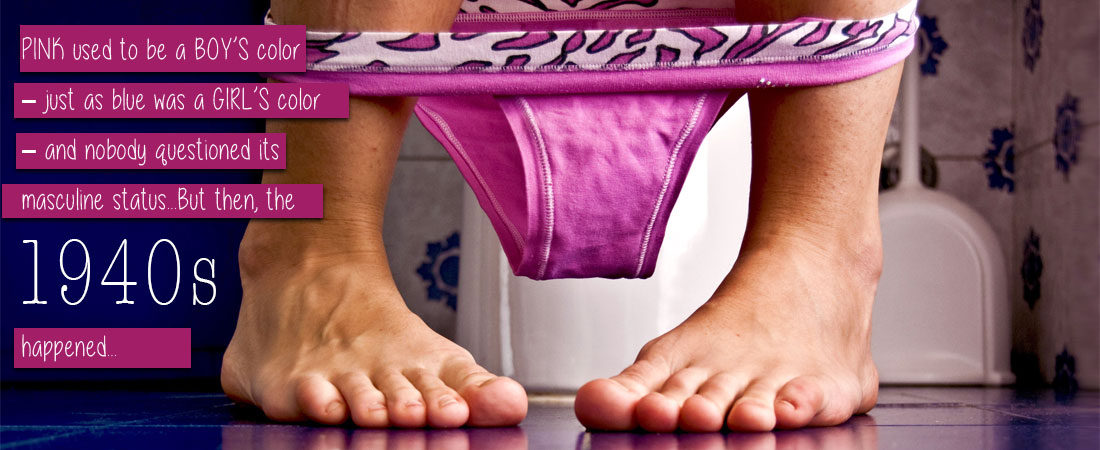
Life was pretty straightforward for pink, until the 1940s happened. It used to be a boy’s color – just as blue was a girl’s color – and nobody questioned its masculine status or masculine qualities of courage and vitality.
After children grew out of their unisex bleached white clothes at the age of 6, they wore pink if they were boys; blue if they were girls.
And then, like the earth’s great magnetic pole-flip, the two colors were forced to switch roles. Blue manned up and shifted over to the boy’s side without incident. Pink, on the other hand, over-compensated for its new gender assignment by turning so Barbie and bubblegum that even women worried about expressing their fondness for it.
Struggling with an identity crisis for decades, pink finally found unexpected support in metrosexual men who rejected the bias against pink and wore the color as a bold statement of cool unconformity.
But even this victory was shortlived. A few years ago, pink was dealt a body blow when some researchers declared pink to be a “non-color”.
Their theory was pretty sound. None of us had ever noticed that pink does not exist in the color spectrum. Created by mixing red and violet, it was impossible for pink to be a color wavelength as red and violet sat at opposite ends of the rainbow (remember ROYGBIV?). They couldn’t meet. Therefore, pink could not be a color.
At the Bodmin Magazine office, we do not contest this premise. We simply protest the uselessness of it. We’re happy to embrace pink as a figment of our imagination – the same way we recognize all colors by how our brains respond to them. We’re okay with pink being just an “idea”. We don’t understand what color wavelength means anyway, and if pink doesn’t really exist in nature, we’ll just mix some up and call it pink. Like roses have been doing so long. And strawberry ice-cream.
And home décor. Pink can lighten to a pearly pastel, it can darken to fuchsia, but there’s plenty of room for pink in home décor. The combination of soft pink and black will always suggest high-end luxury. Pink with chocolate brown accents – pretty much the same thing. Reinforce it with gold and we’re heading towards rococo classic. Make it candy cute, and it’s My Little Pony and every little girl’s dream.
Now which pink abolitionist out there wants to mess with a little girl’s dream?


